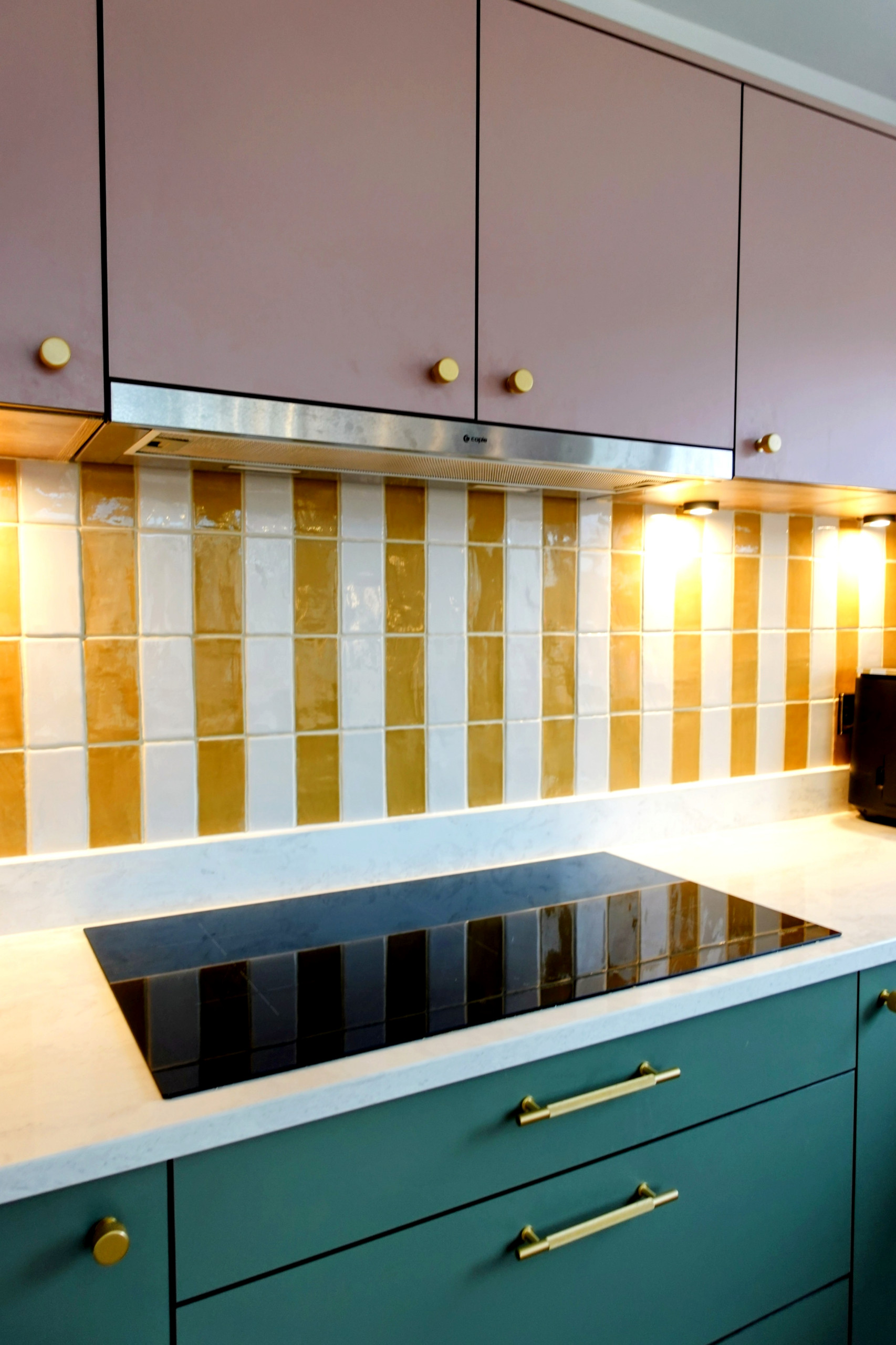
Why Kitchen Colours Look Different in Every Home
One of the most common things homeowners say during a kitchen project is:
“I love the colour… but it doesn’t look how I expected in my space.”
This is completely normal — and it doesn’t mean the colour is wrong.
Kitchen colours behave very differently depending on the environment they’re in. Understanding why this happens makes choosing finishes far less stressful and leads to much better outcomes.
1. Natural Light Changes Everything
The direction your kitchen faces has a huge impact on colour.
- North-facing rooms tend to make colours feel cooler and flatter
- South-facing rooms usually make colours feel warmer and brighter
- East- and west-facing rooms can change dramatically throughout the day
A colour that looks perfect at midday can feel completely different in the morning or evening.
2. Artificial Lighting Alters Colour Tone
Lighting isn’t neutral — even when it looks white.
Different light sources:
- warm LEDs add yellow or red tones
- cool LEDs introduce blue or grey tones
- spotlights and under-cabinet lighting create highlights and shadows
This can subtly (or sometimes noticeably) shift how a kitchen colour appears once installed.
3. Surrounding Materials Influence Perception
Colours don’t exist in isolation.
Kitchen finishes are affected by:
- flooring colour and texture
- wall paint
- worktops and splashbacks
- adjacent rooms and sight lines
A soft neutral can feel warm next to timber, but cooler next to stone or tile. The same colour can feel completely different depending on what’s around it.
4. Finish Type Makes a Big Difference
The same colour in different finishes won’t look the same.
For example:
- matt finishes absorb light and feel softer
- satin or eggshell finishes reflect more light
- textured or grained finishes add visual variation
This is why colours can feel richer or flatter than expected once fitted across large areas.
5. Screen vs Real Life
Colours viewed on:
- phones
- tablets
- laptops
are influenced by screen calibration, brightness and contrast settings.
A colour you’ve fallen in love with online is only a starting point — not a final decision.
6. Scale Changes How Colour Feels
A colour sample might look perfect in your hand, but once applied across:
- tall units
- long runs of cabinetry
- large wall areas
it can feel stronger, darker or more dominant than expected.
This is one of the biggest surprises for homeowners — and also one of the easiest to manage with good planning.
How to Choose Kitchen Colours with Confidence
The most reliable way to choose a kitchen colour is to:
- view physical samples in your own home
- look at them at different times of day
- place them next to floors, walls and worktops
- consider finish as well as colour
Digital visuals are helpful, but real-world context always matters more.
Final Thoughts
When a kitchen colour looks different in your home, it’s rarely a mistake — it’s usually the result of light, materials and environment working together.
Understanding this early makes the process calmer, more enjoyable and far more predictable.
The best kitchen colours aren’t the ones that look perfect everywhere — they’re the ones that work perfectly in your space.